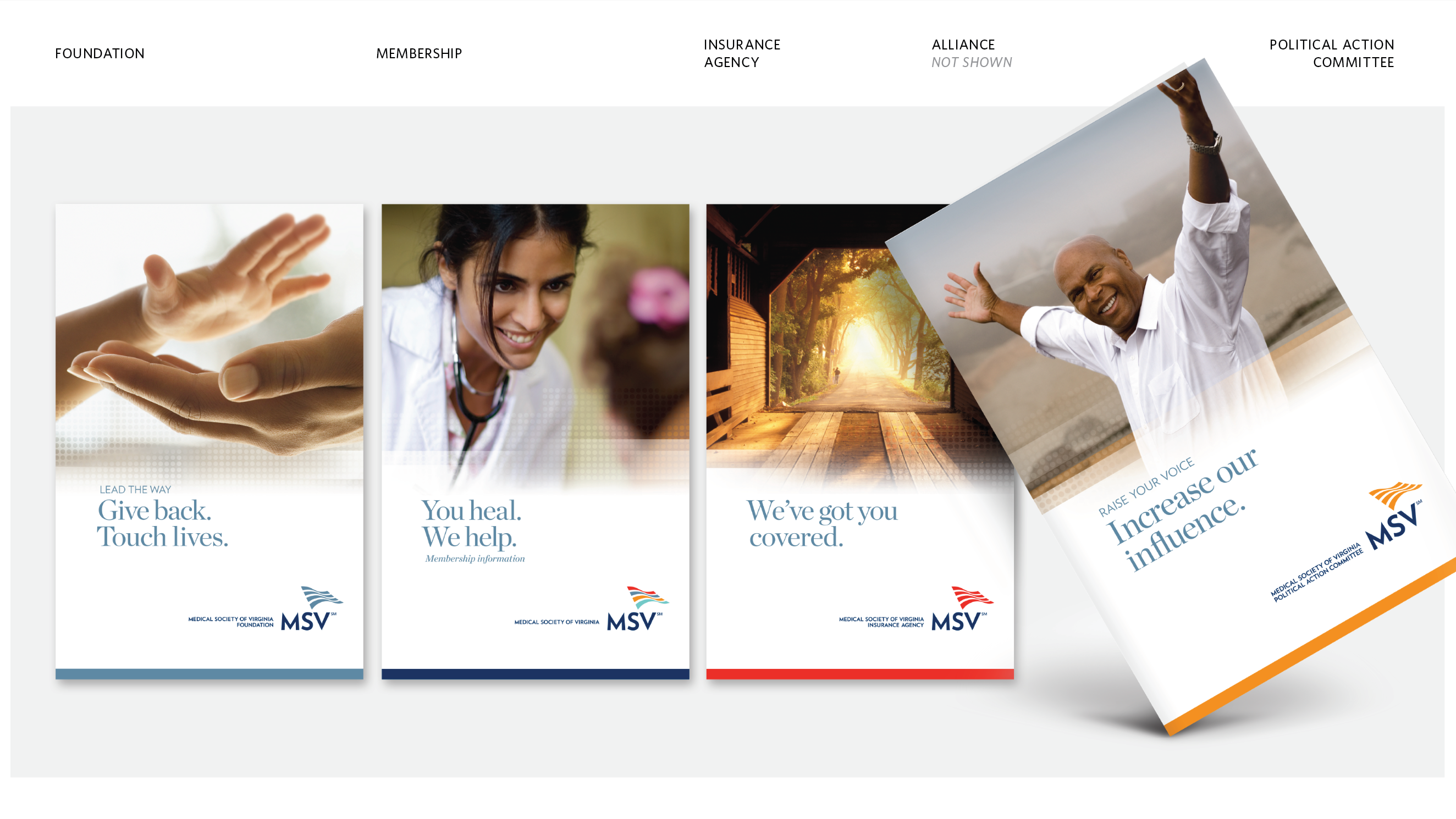
REBRAND NEW NAME IDENTITY COLLATERAL WEBSITE ANIMATION SIGNAGE
Work co-created with Dee Papit of Lone Wolf Marketing
BLTdesign partnered with brand strategist Dee Papit of Lone Wolf Marketing to reimagine Greater Richmond ARC, a nonprofit supporting individuals with disabilities and their families.
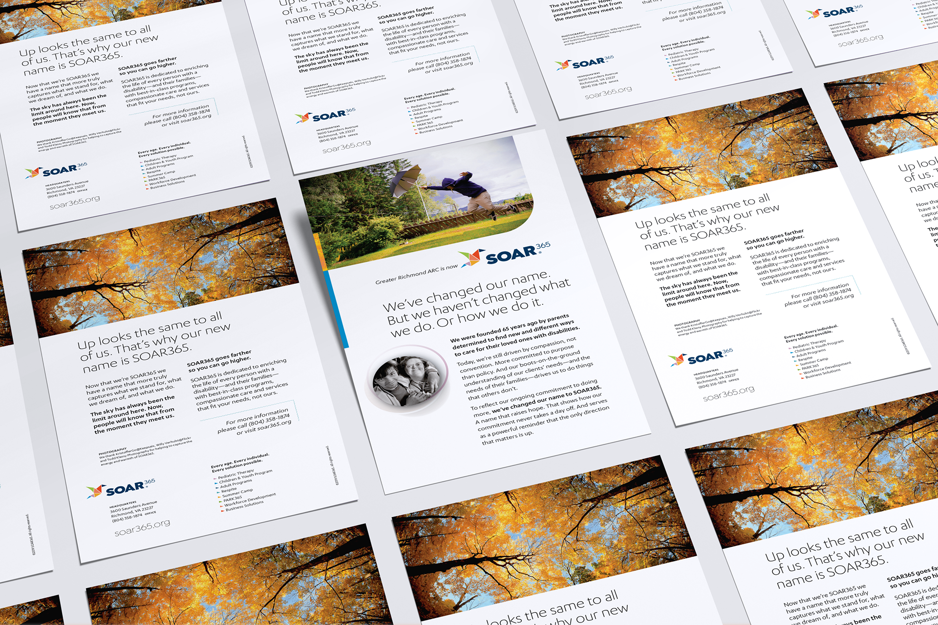
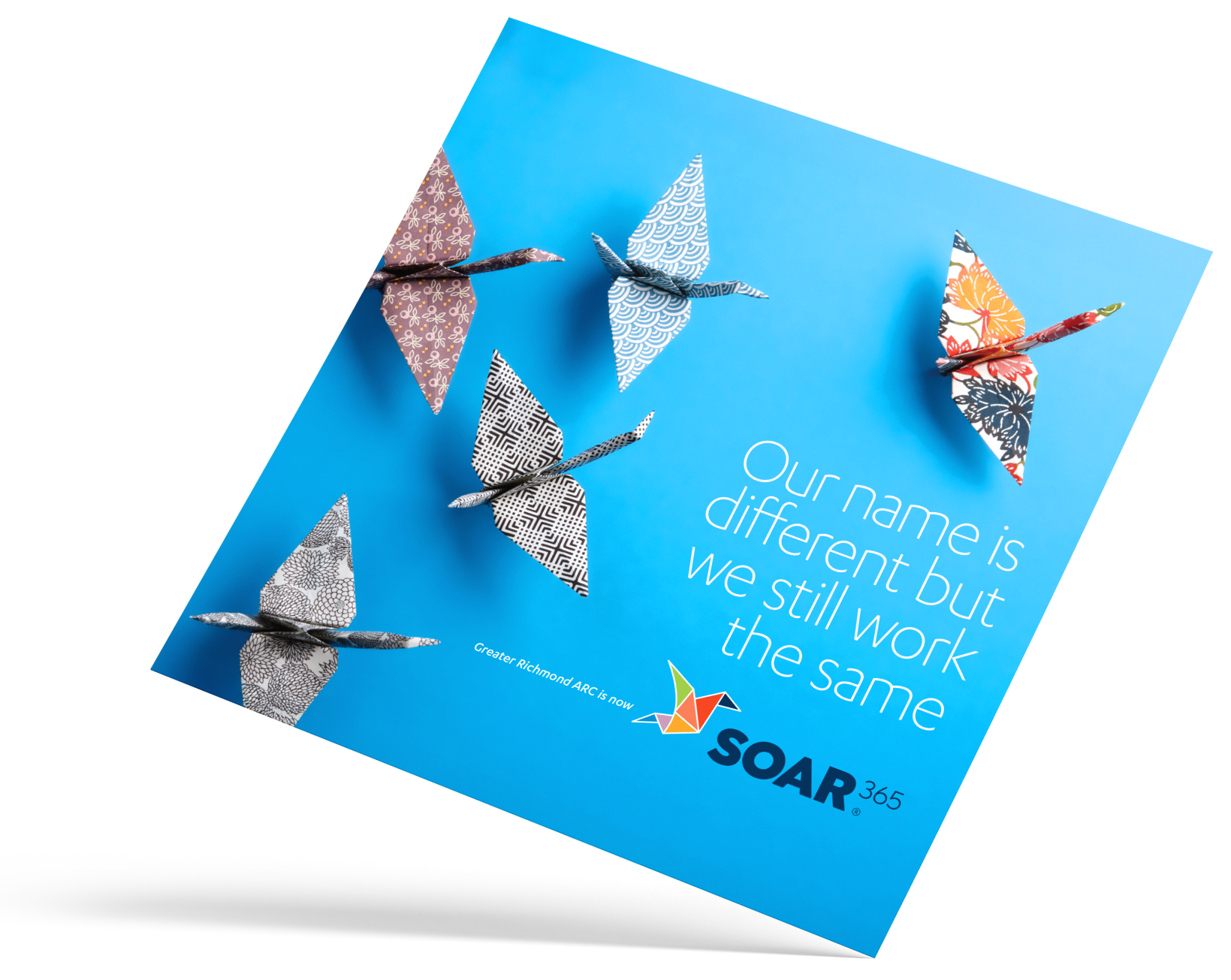
During our brand study, it became clear that the name “ARC” was problematic. Originally an acronym for “Association for Retarded Citizens,” the term “retarded” is now outdated and offensive. Although National ARC had dropped the acronym seven years earlier—treating “ARC” as a standalone name—this lack of meaning didn’t resonate with Richmond ARC’s community. Dee and I agreed that a name without meaning weakens a brand. Interviews confirmed this, with many families and stakeholders expressing strong feelings about the issue. Our study recommended a bold change: renaming the organization. Richmond ARC embraced this, and today they are SOAR365.
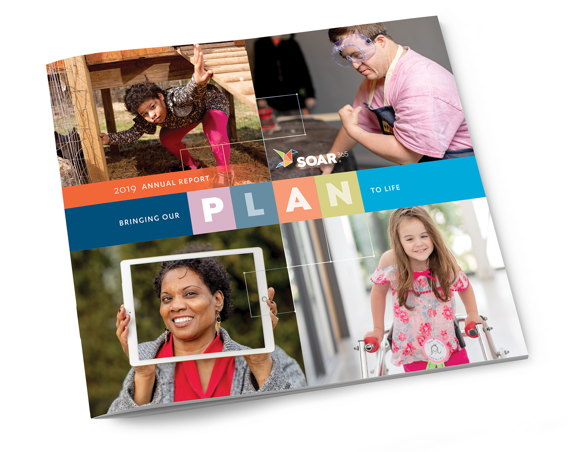
SOAR365 remains a leading Virginia nonprofit, dedicated to creating meaningful opportunities for individuals with disabilities. Following board approval, BLTdesign collaborated with senior leadership to rename and fully rebrand the organization, introducing SOAR365 to clients, staff, families, and stakeholders.
Everyone wants to SOAR. To do more than they (or the world at large) imagine they can. Individuals with disabilities can soar, their families can soar, agencies can soar. And we as a community can do more too, when we become a part of this movement.
From our inception, we challenged the conventional thinking about people with disabilities. While others had a limited vision of what people with disabilities could do, we knew they could SOAR if put in the right circumstances. Now, more than 60 years later, we’re still looking for inventive, pragmatic and supportive ways to help this community achieve independence and reach their loftiest goals.
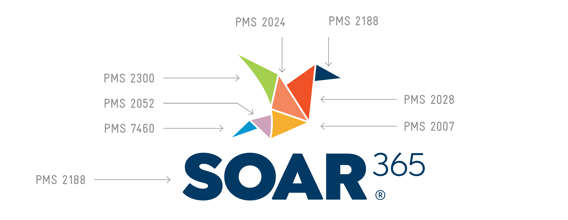
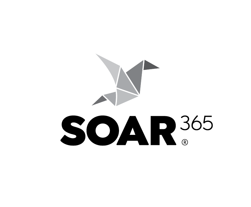
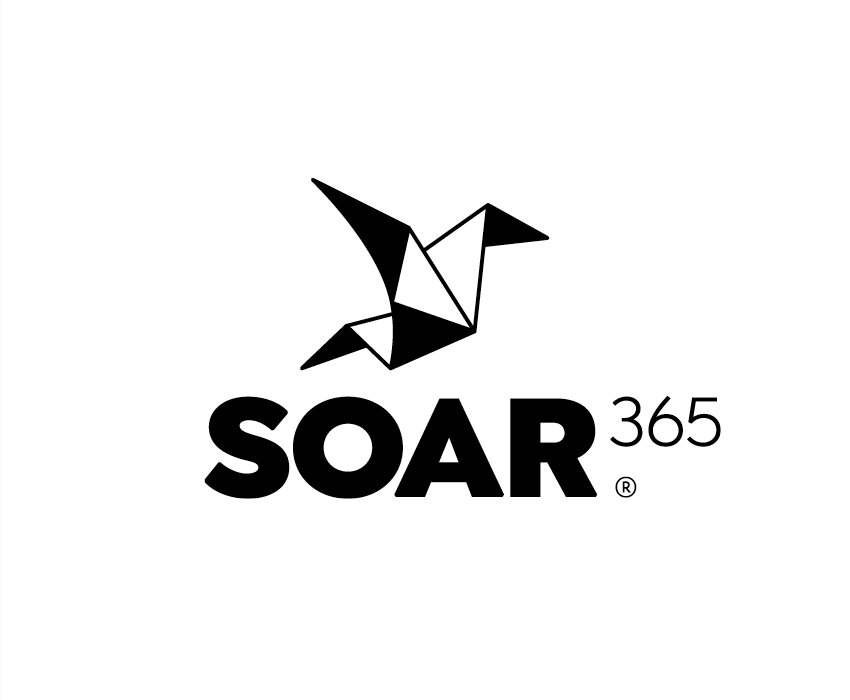
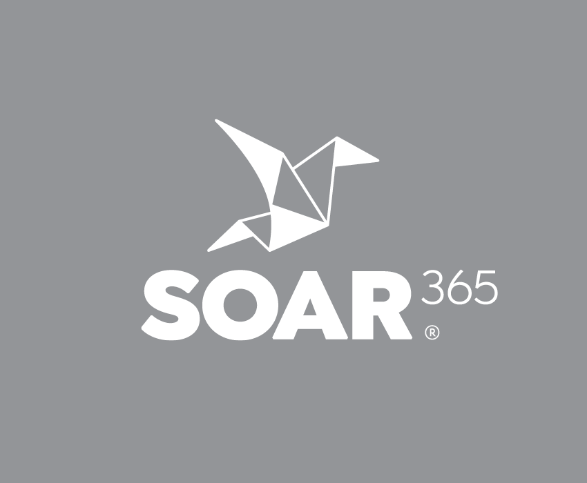
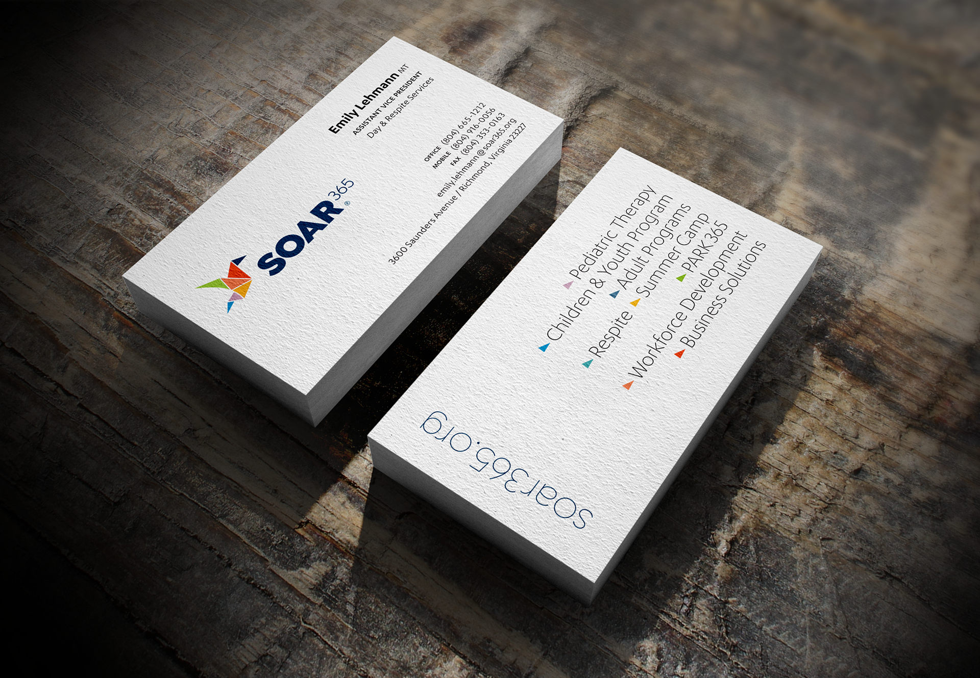
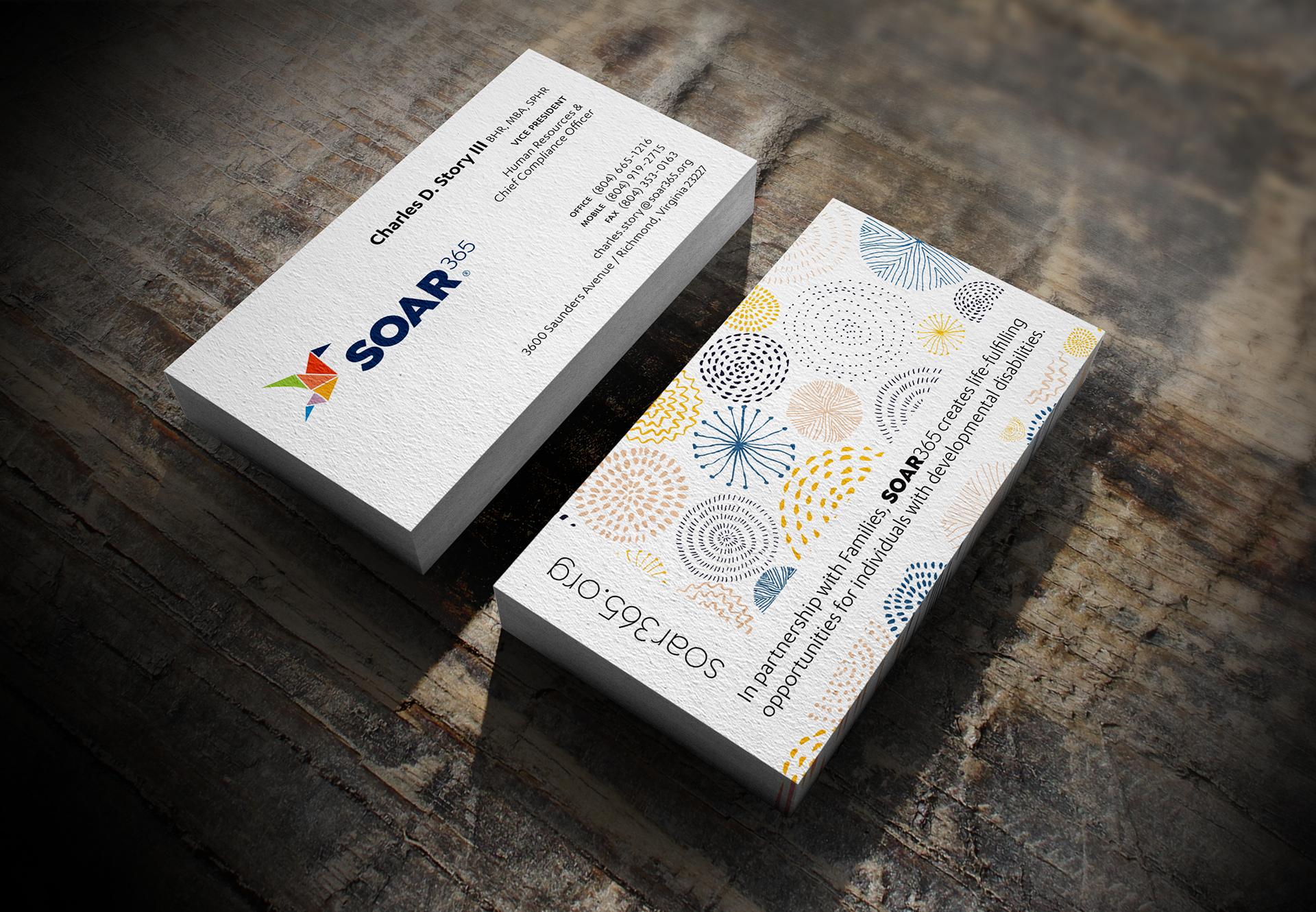
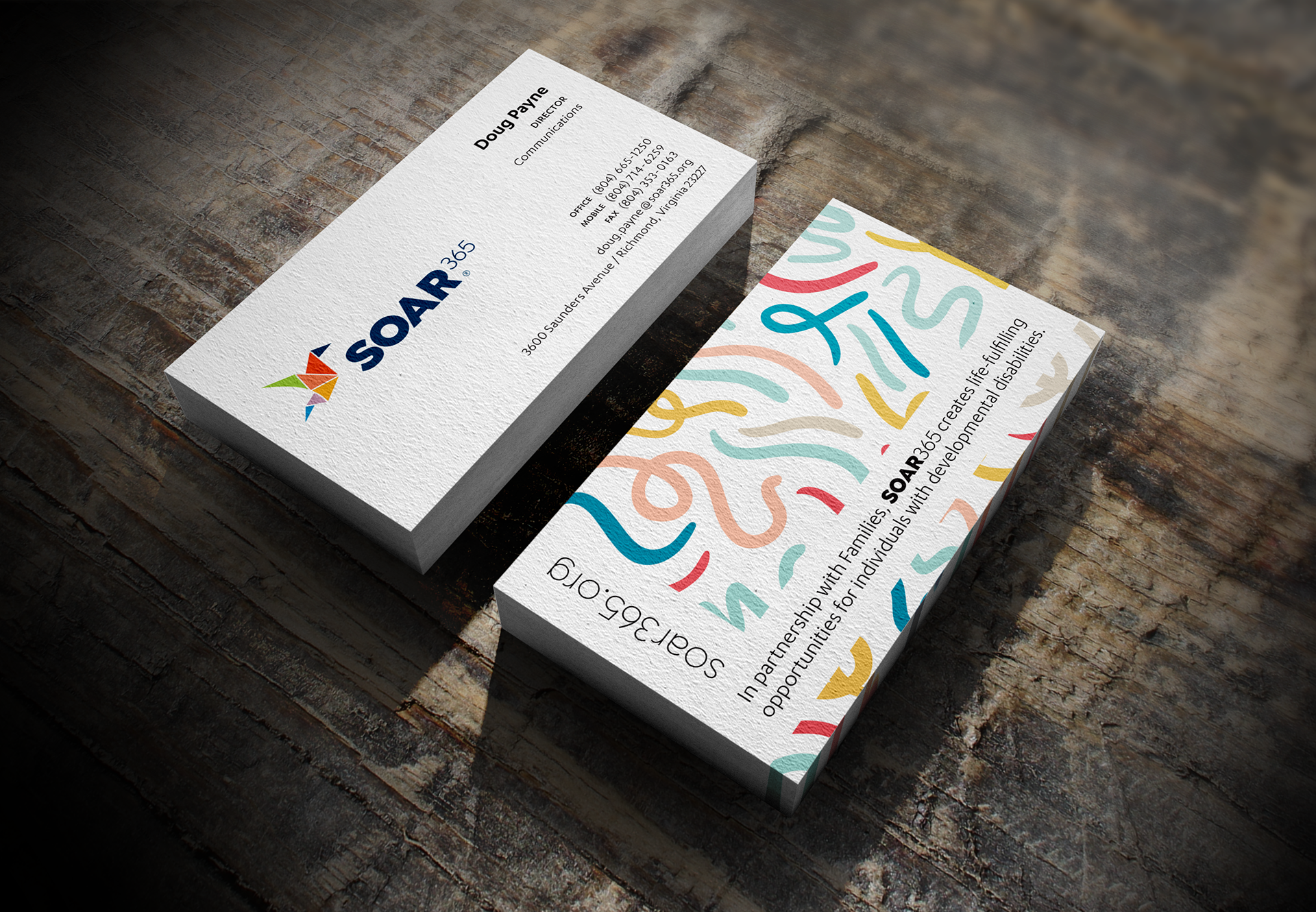
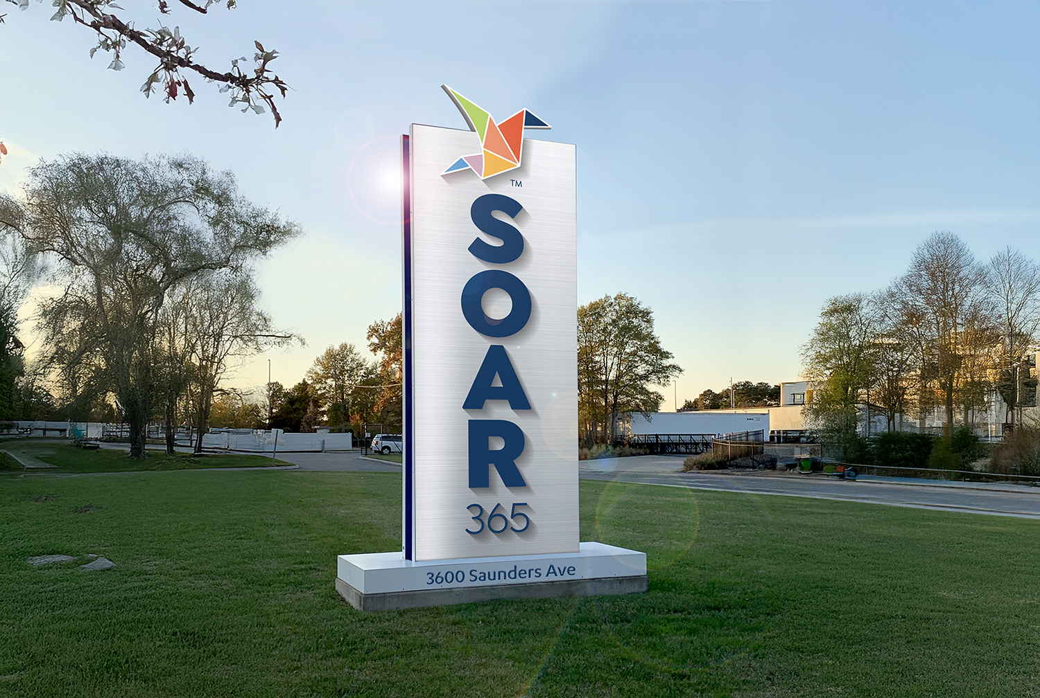
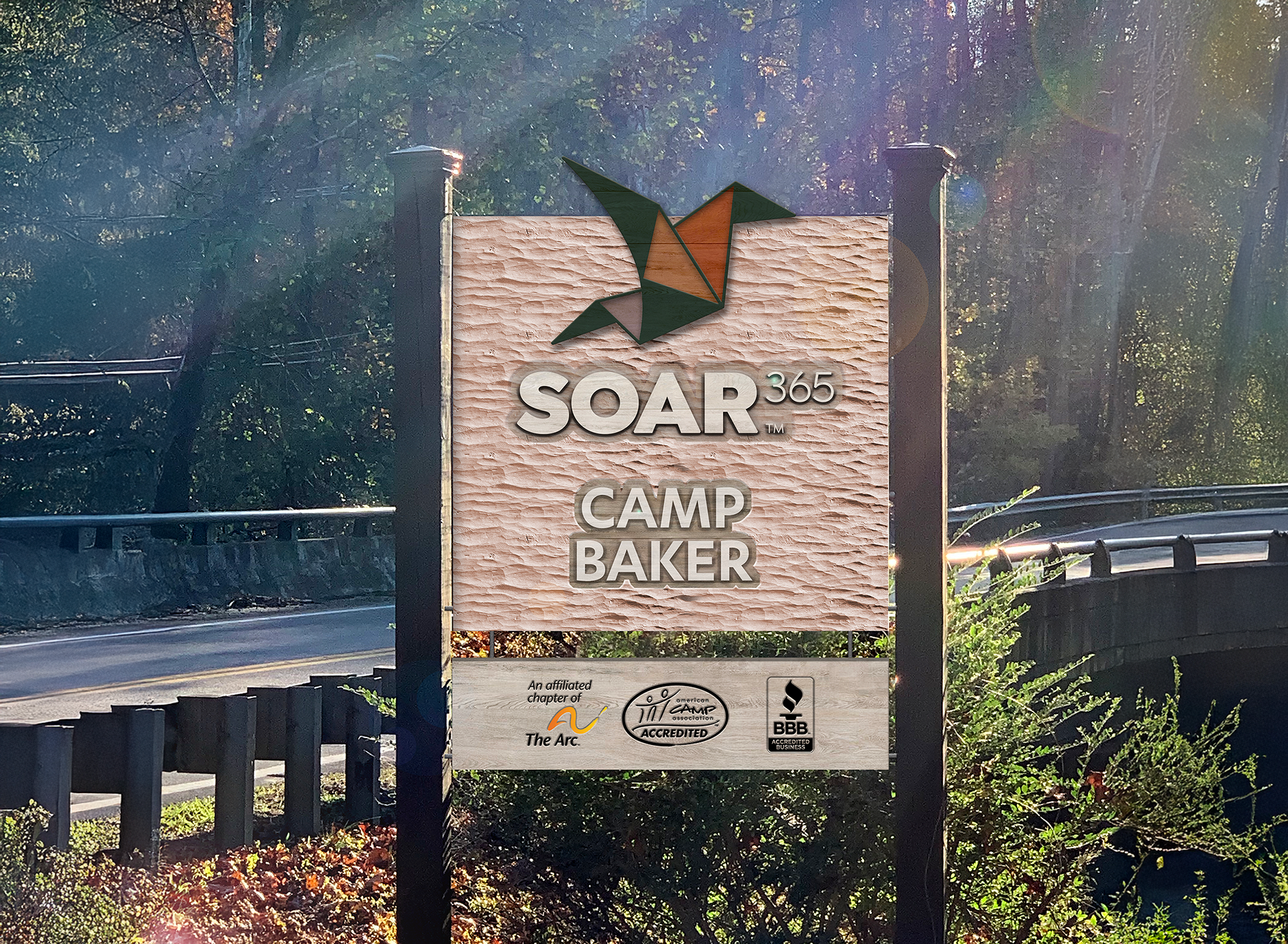
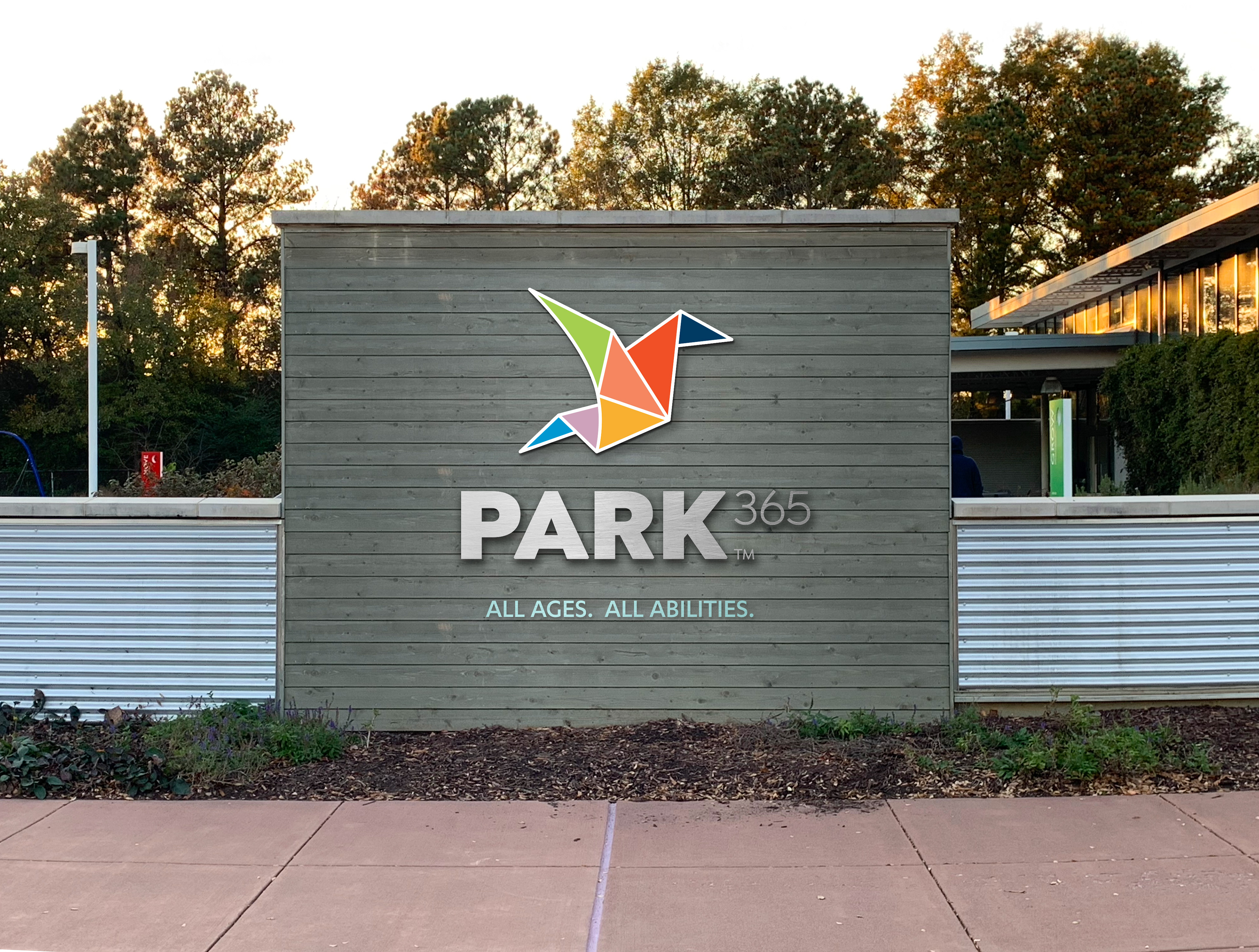
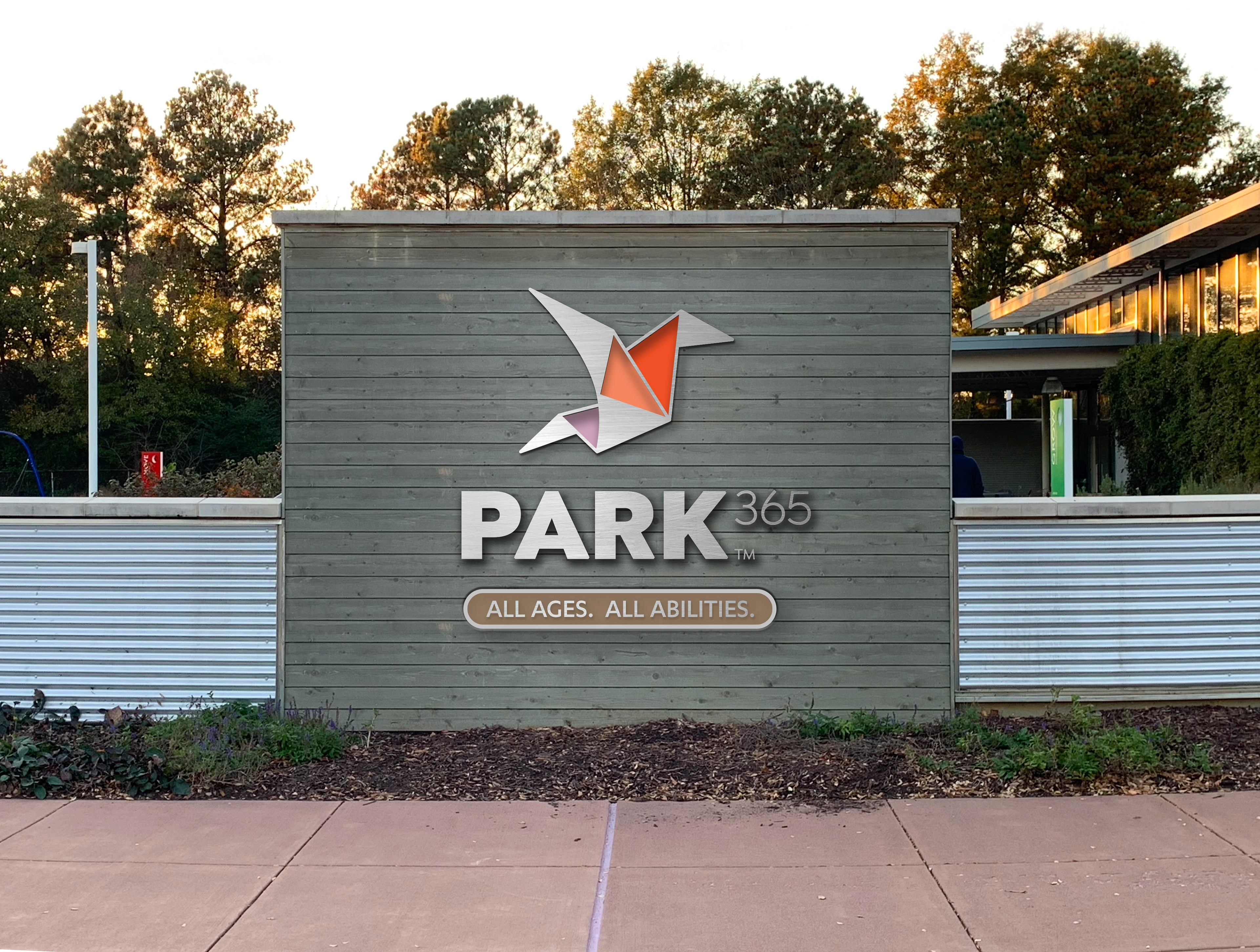
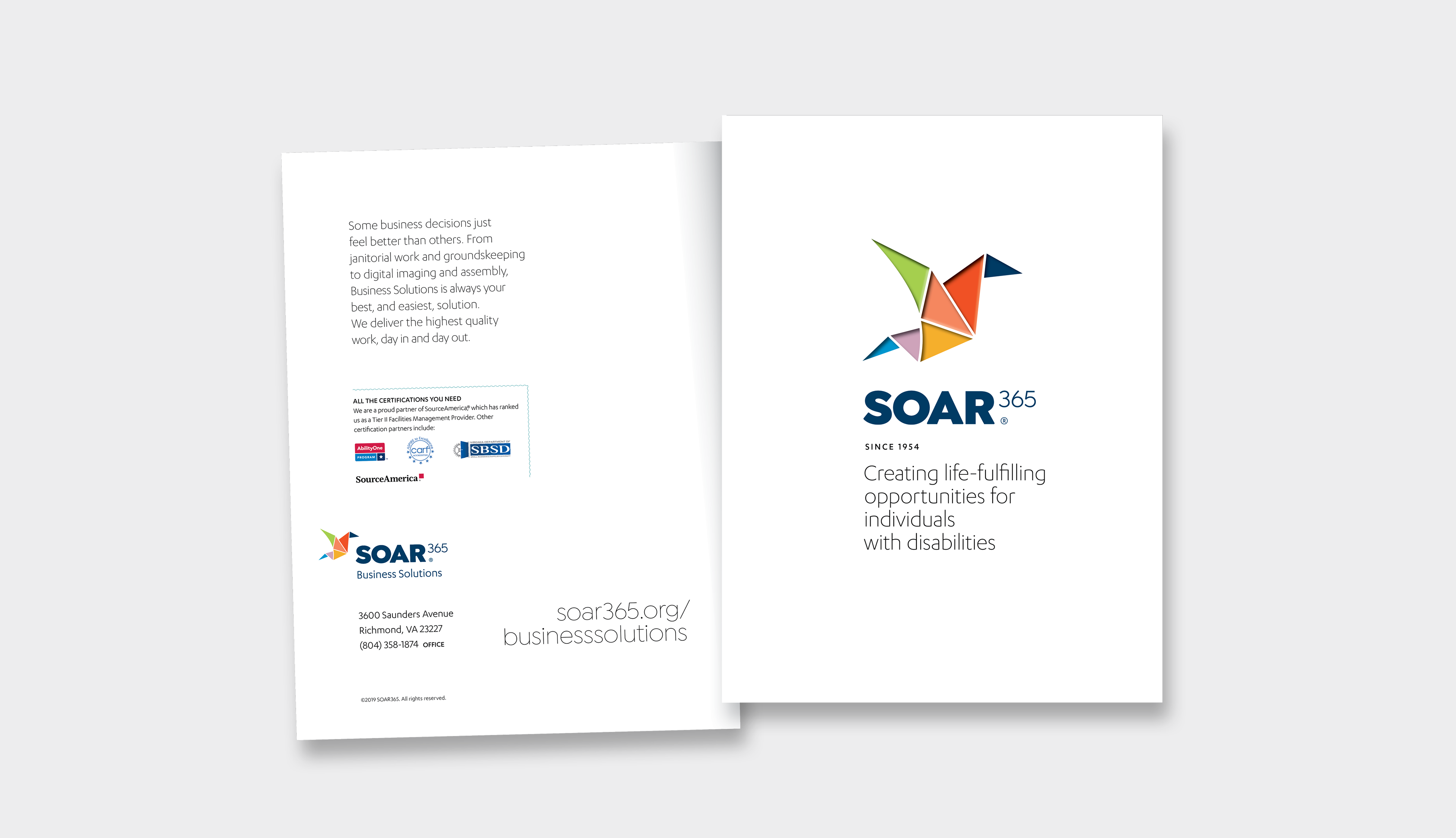
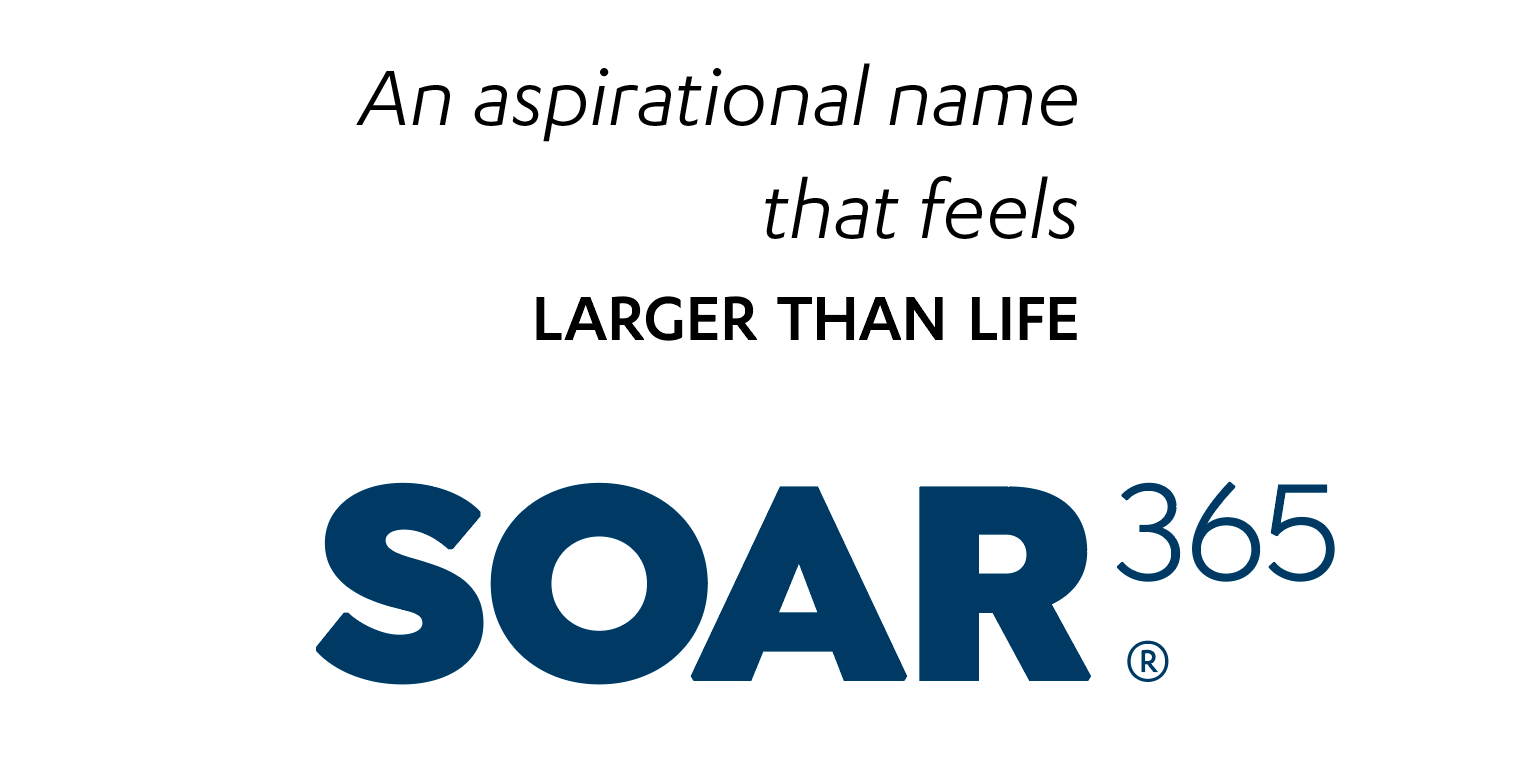
The SOAR365 letterforms are grounded, solid and substantial—communicating confidence and longevity. By including the 365 suffix, we also tell families and clients that our commitment never takes a day off. And because the numerals are expressed as an exponent, it makes our dedication seem exponentially large.
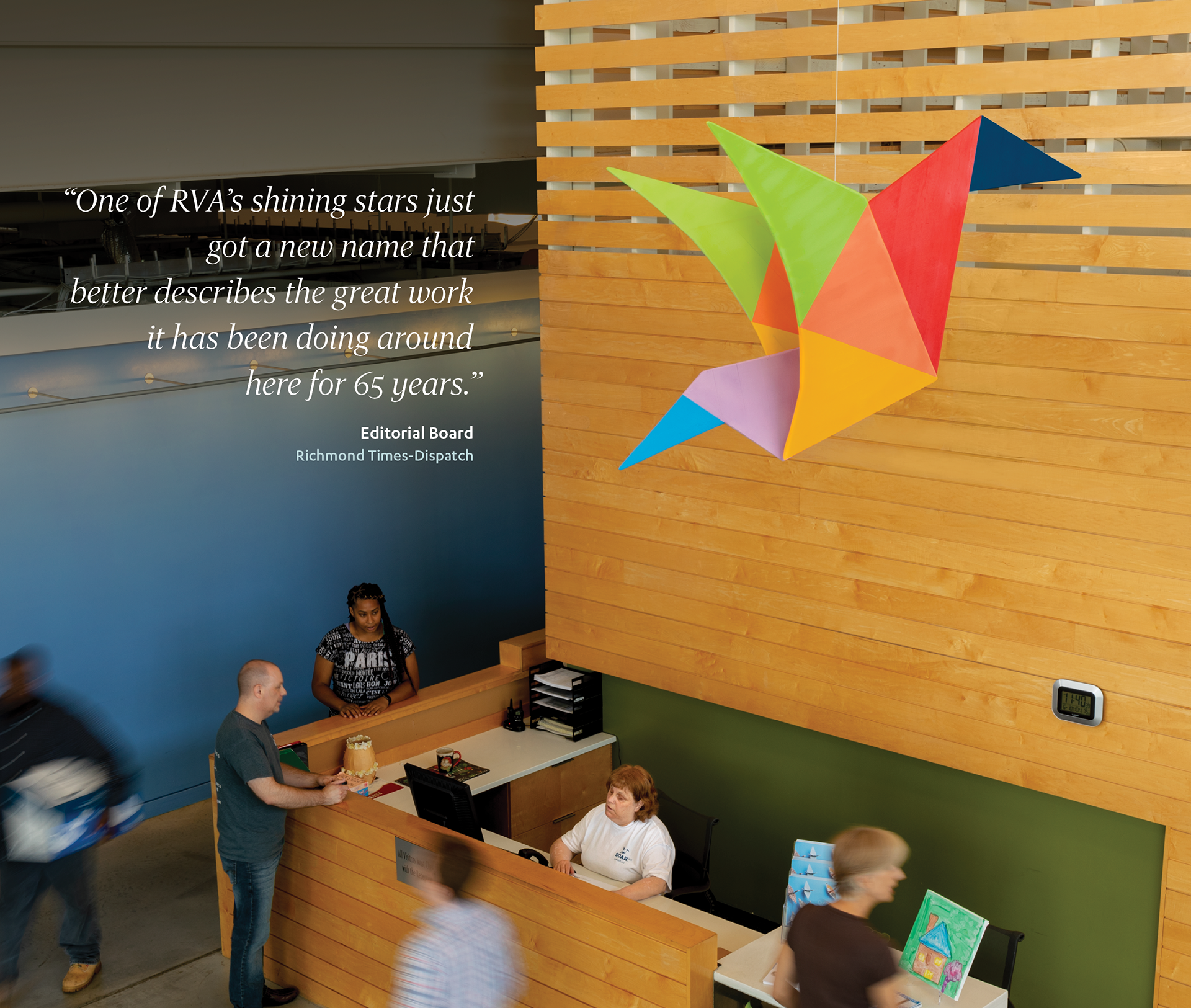
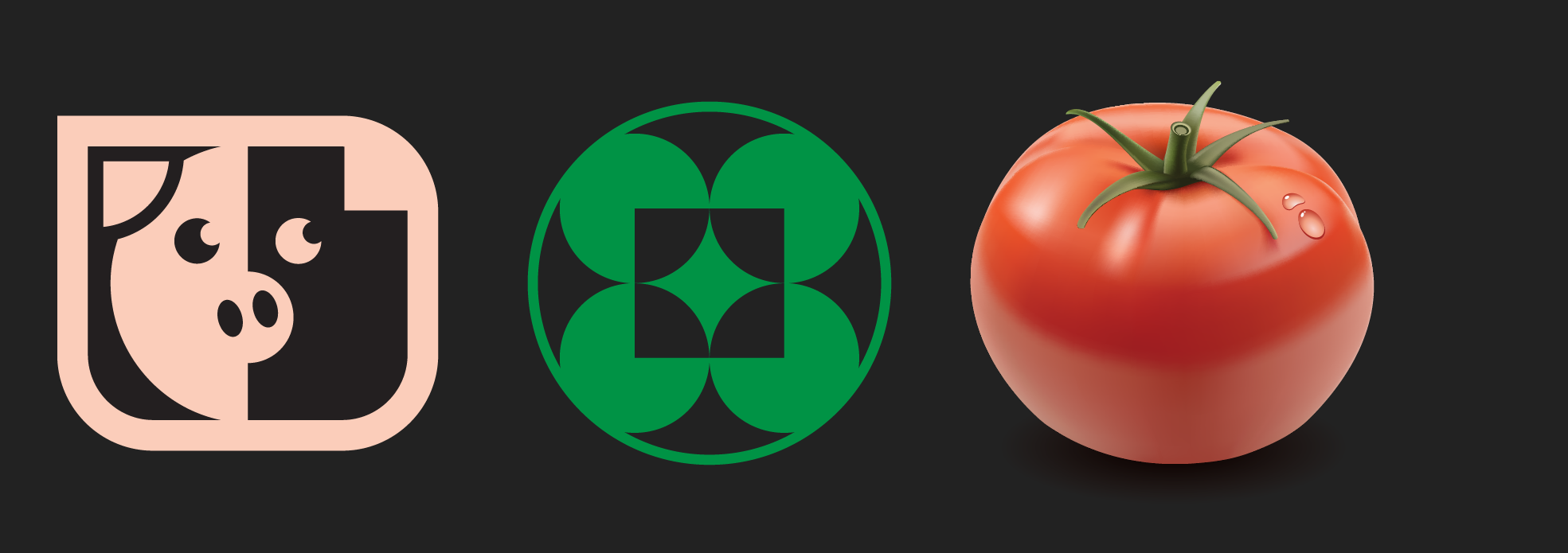
The SOAR365 symbol (Skylar) is comprised of seven simple, geometric shapes that converge to create a solid origami crane. The crane is a symbol of long-life, as Japanese folklore believes the crane to live for 1000 years. The crane is also a symbol of happiness, good luck and peace.
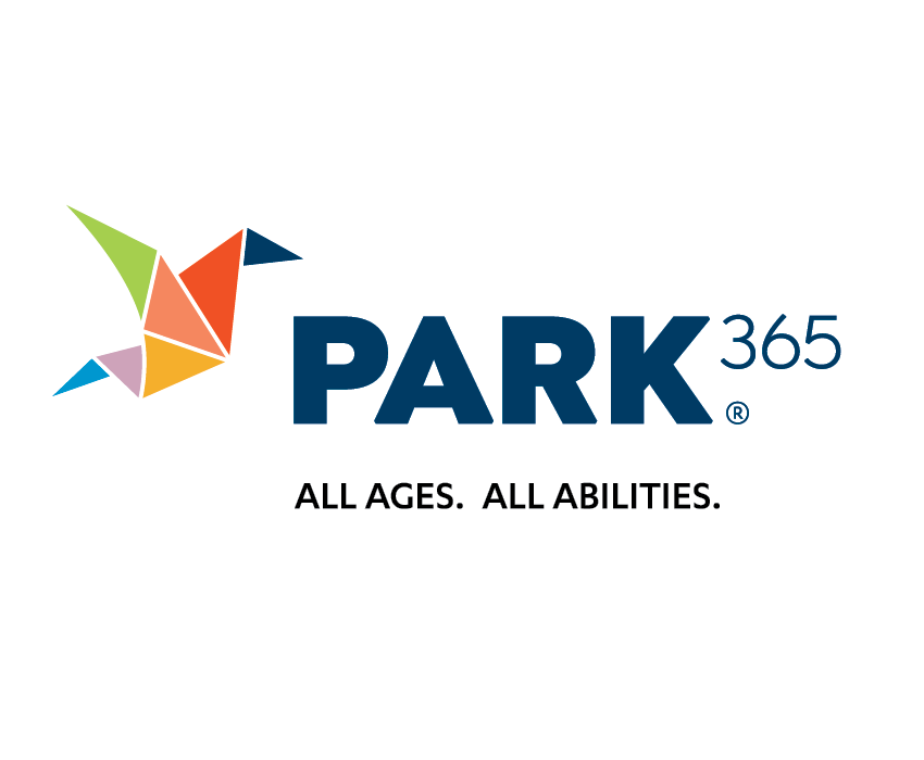
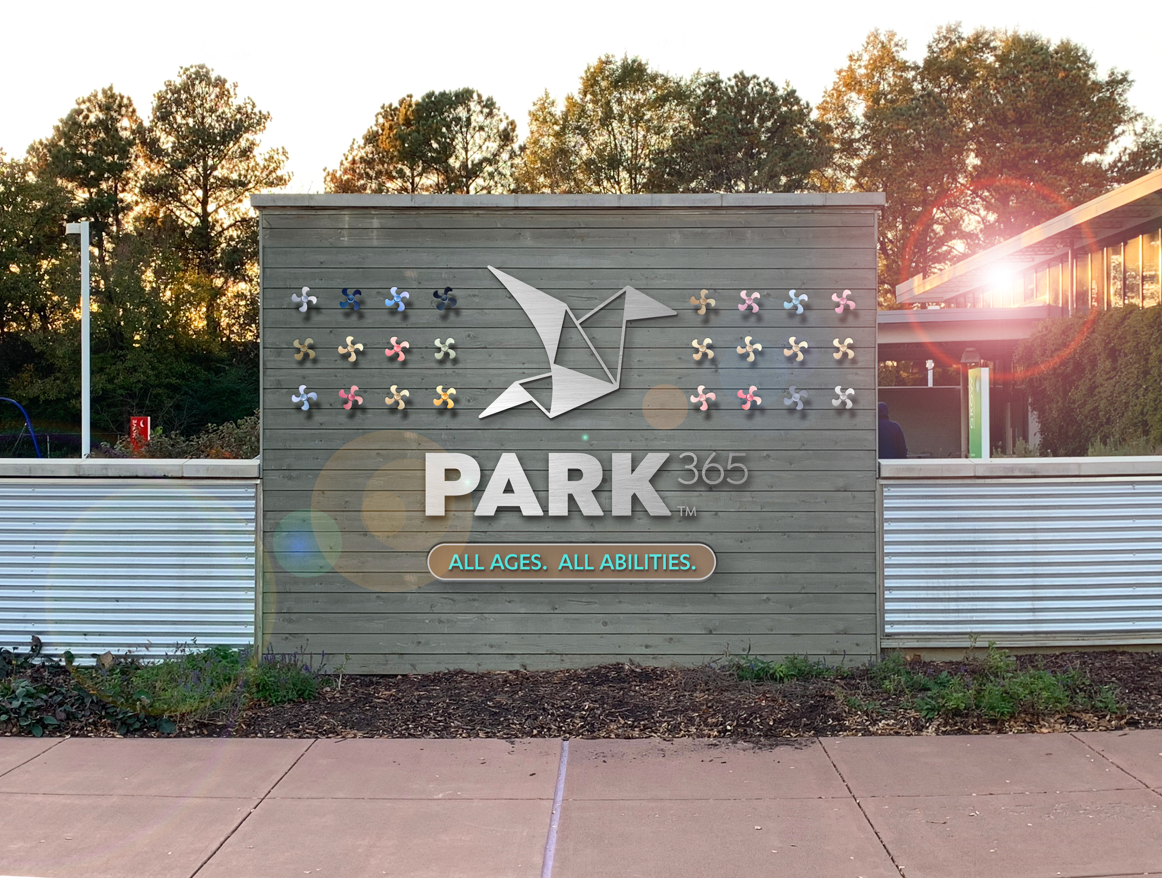
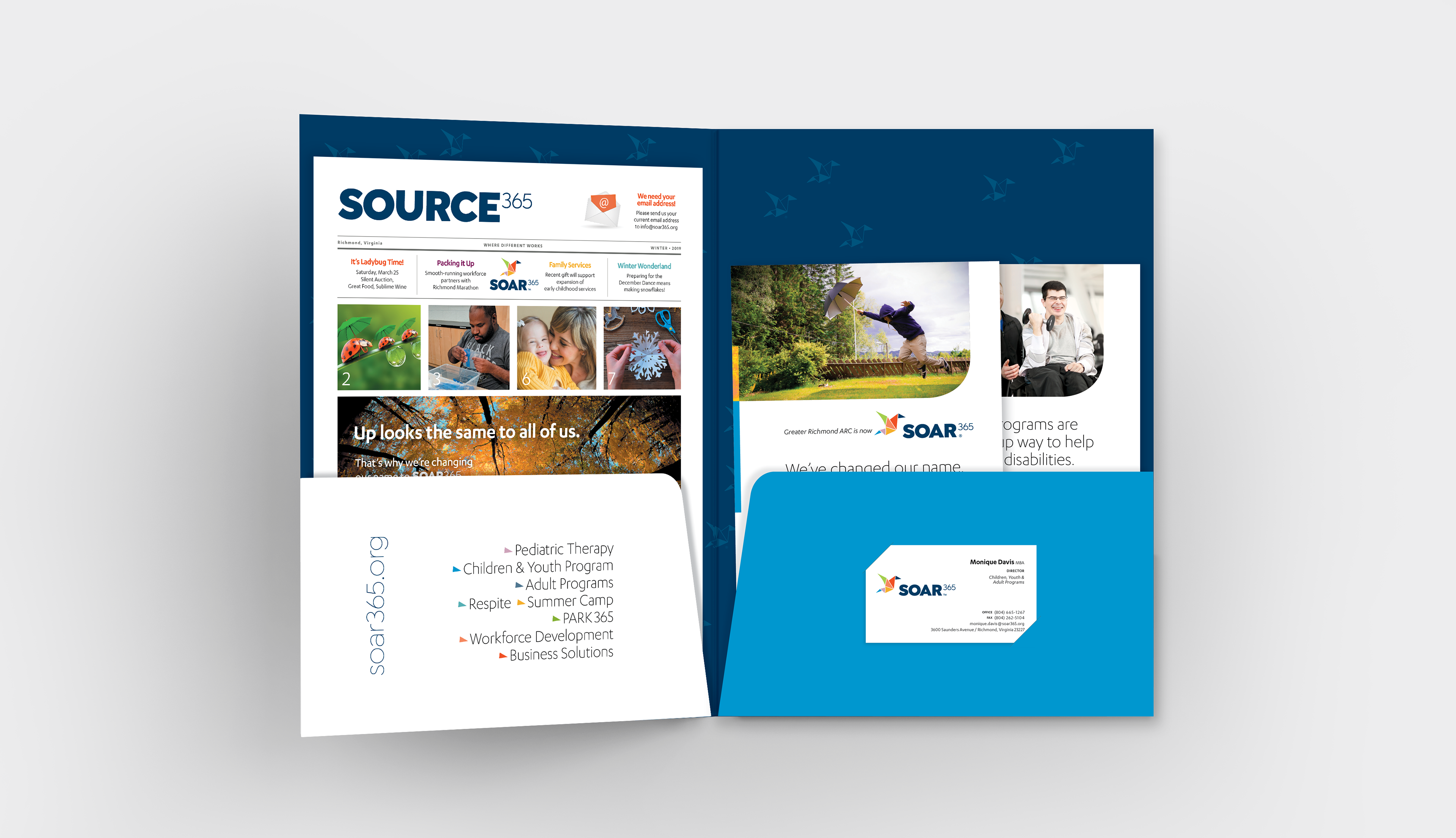
Our color palette is contemporary and trends away from the more traditional primary hues typical of the disabilities and child-care industry. It is a palette equally at home in the corporate boardroom, playground, clinic and workspace.